Pinterest Redesign
Most important functionality/purpose of Pinterest: As a research/exploratory tool, for inspiration, for fun
Learnings from Contextual Inquiry
Most used app features: Homepage, Search bar, “More like this” section, My boards
Allowed users to explore specific ideas already in their mind & content already tailored to their likes/preferences.
Least used app features: Updates/Inbox, Today page, Shop, captions under photos
Added to cluttered design and distracted from/provided less value to users’ end goals
Main attention-catcher: Homepage tile grid
Pinterest’s place in users’ lives: During down time/free time, on an ad hoc basis
current app issues
Overwhelming amount of content that forces users to run in the same circles when searching for specific types of content
Can be improved with features that categorize, filter, and organize content
Cluttered, distracting, and redundant information and UI features
Such as long captions, unnecessary profile details, random shopping and social features, etc.
Can be abstracted for a more minimalist and simpler design
Illogical hierarchy of important information & badly organized pages that cause long vertical scrolls
Personas
Jasmine Costas
AGE 19
EDUCATION HS Diploma
STATUS Single
OCCUPATION Student
LOCATION Arizona
Bio
Currently studying Sociology and Photography at Arizona State University. Really into art, fashion, and taking nature-inspired photos in her free time. Enjoys camping, hiking, and exploring nearby parks with her family.
Core Needs
Needs some form of digital therapy to destress from school.
Needs to be on top of new fashion and style trends.
Must have her phone or camera on her at all times.
Frustrations
Is having a hard time finding inspiration for her own photography.
Feels overwhelmed with the amount of random content constantly being shown to her on social media.
Frequently Used Apps
Instagram, TikTok, Pinterest, Snapchat
Katie Rynn
AGE 32
EDUCATION BFA in Graphic Design
STATUS Married
OCCUPATION Product designer
LOCATION New Jersey
Bio
Full-time product designer at IBM. Works remotely from home, and is a mom to 2 toddlers at the same time. Enjoys finding and cooking new recipes for her family. Always throws large holiday parties and loves gift-giving.
Core Needs
Must have 30 mins of “tablet time” to destress before bed.
Needs more arts, food, and travel ideas to change up her family’s daily routine.
Frustrations
Wishes she can put her creativity to more use at work.
Frequently Used Apps
Facebook, Pinterest, Instagram, Youtube
Ideation
User Scenario (Persona 1)
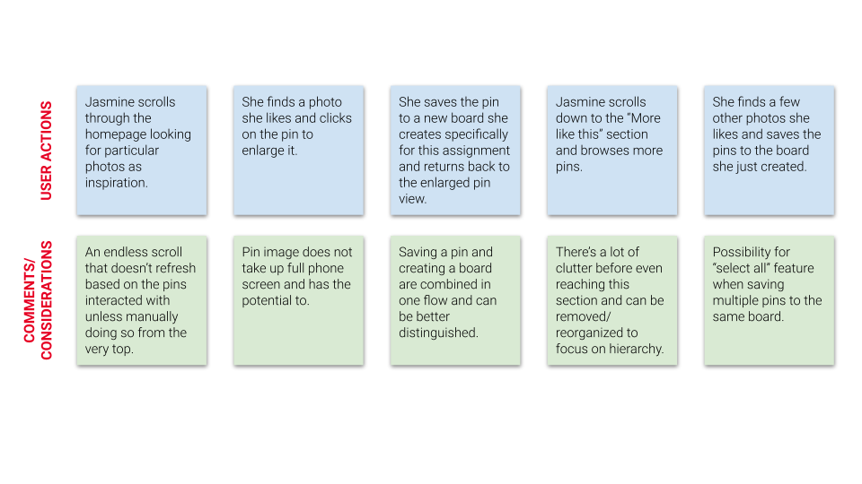
Jasmine has an assignment due soon for her Intro to Photography class. She is searching for nature and landscape photos as inspiration.
Current Site Map
Documenting the current Pinterest website’s information architecture to gain a better understanding of how the bulk of key information is organized and categorized.
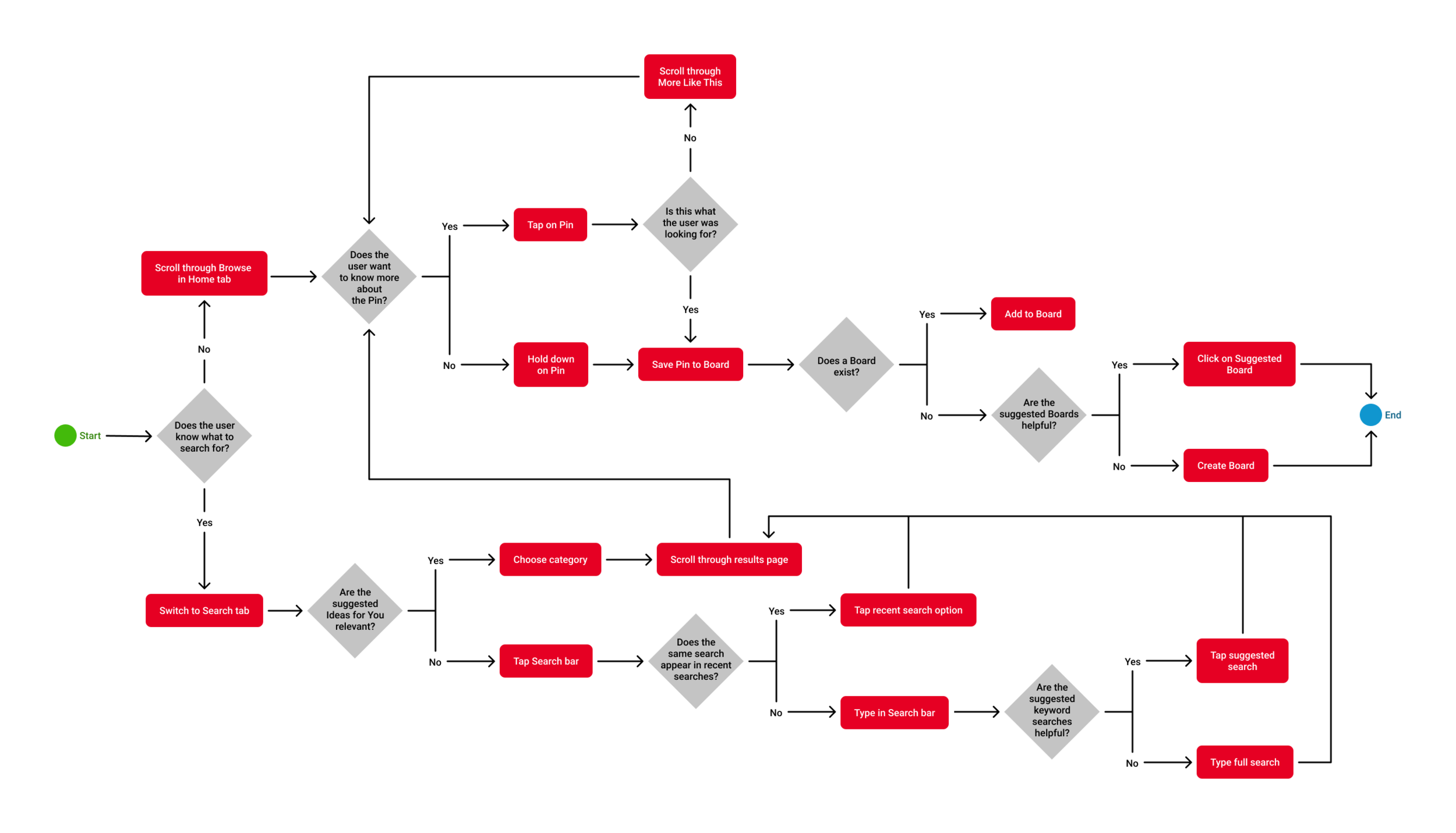
Task Flow
Persona 1’s end goal: Save a pin to a new or existing board
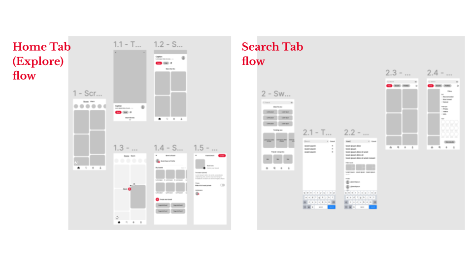
Wireflow
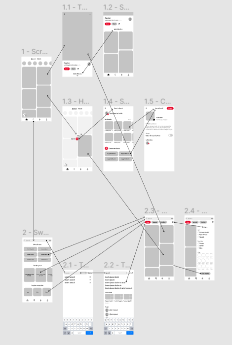
Linking the initial set of low-fidelity wireframes to one another to mimic what buttons and features lead to what pages in preparation for actually prototyping the interactions.
Low-Fidelity Wireframes

Prototyping + Testing
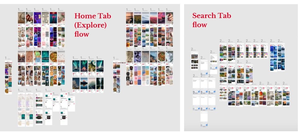
high-fidelity Wireframes
User Testing Feedback
positive takeaways
User Difficulties
Intuitive design → users reached the end goal of saving a pin to a new or existing board quickly & with ease
“Sleek & less cluttered” / “Cleaner than the mobile app and much nicer than the desktop view”
New features are helpful in finding favorable pins to save
i.e. refresh button, search filtering, tabbed content in search results
Scrolling through ‘More like this’ would get stuck, and return to previous page button was unresponsive
User desired a secondary way to get back to previous page, such as swiping left from the edge of the screen
Was not apparent when task of quick saving pin/creating new board was completed with current notification banner.
Prototype fixes
Interactions:
Fixed scrolling down to ‘More like this’ section & return button function using “Navigate to” interaction
Added a swipe left gesture to go to previous page
Design:
Altered the notification banner to be centered, bolder, and include an identifiable icon
Accessibility:
Unified the colors of < and … to white, adding a semi-opaque background for better visibility
Brought smaller font sizes up to at least 16pt
Created more space between expand to read More and user profile
Reworked the share icon to appear more subtle, less contrasting


overview of new features
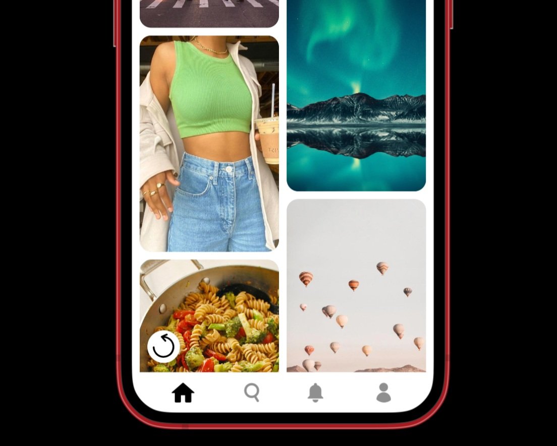
Refresh Button
Current design: Pull down from top of homepage to refresh
How can users refresh after scrolling down for a while without scrolling all the way up?
Redesign: Manual refresh button on homepage to shuffle content
Tabbed Content
Current design:
Organized by Pins/Accounts/Your pins while typing search
Organized by Explore/Shop/Profiles on results page
What kinds of content do users really want to see when searching?
Redesign: Search typing and results pages both categorized by Pins/Boards/Profiles
Search Filtering
Current design: Filtering ability only on Shop tab (by price and seller profiles)
How can users find specific content to save without having to scroll endlessly?
Redesign: Filter panel on Pins tab (includes sort by, image type, color, etc.)
overview of design changes


Overview of Design Changes
Reducing Clutter
Current design: Busy UI with captions, profile details, # of likes, comments, etc. under each pin on homepage/in enlarged pin view
What information do users want to consume and what distracts them?
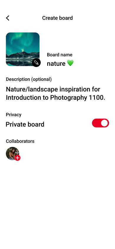
Redesign: Clean, minimalist design focused on hierarchy of important information and visual elements related to pins

Improving Hierarchy/Scroll
Current design:
Save to board page is very list-like w/ the Create board button at the bottom
The number of suggested categories in the search tab creates a very long scroll
What information/functions are most important and relevant to users?
Redesign:Less vertical scrolling on pages w/ pertinent buttons and suggestions at the top and unnecessary information removed


